WebStore – Content Pages
Content Pages are web pages used within a WebStore configuration to display text, images, or other content in the lower-right portion of the WebStore browser window. These pages can reference existing *.htm or *.html files, or they can be fully user-defined within the system.
When a WebStore Configuration is created for the first time, three default user-defined Content Pages are automatically generated:
- Home
- Privacy
- Contact Us
These default pages can be modified, or you can create additional pages to customize your WebStore experience.
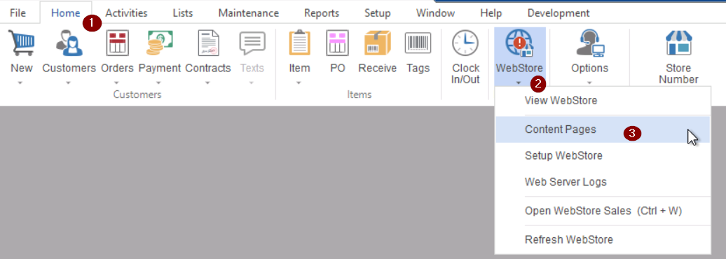
Accessing Content Pages
To access and manage Content Pages:
Home Tab → WebStore Dropdown → Content Pages
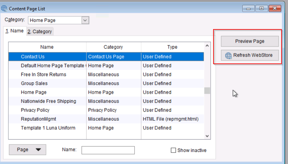
Content Page List Functions
The Content Page List provides tools to manage your Content Pages. From the Page button, you can:
- New – Create a new Content Page
- Edit – Modify an existing page
- Delete – Remove a page
- Copy – Duplicate a page
- Preview – Review the page before publishing
- Refresh WebStore – Reload content updates to the live WebStore
Creating a New Content Page
- Click the Content Page button at the bottom-left
- Select New Content Page
Your new page will open in the Content Page editor.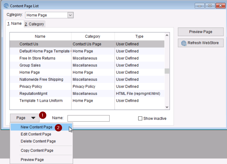
Content Page Structure
Content Pages are built using sections (also referred to as rows). You can add multiple sections to organize your layout.
Adding a New Section
- In the Content Page editor, click the section button at the bottom-left
- Select New Section
You will be prompted to choose one of the three section types: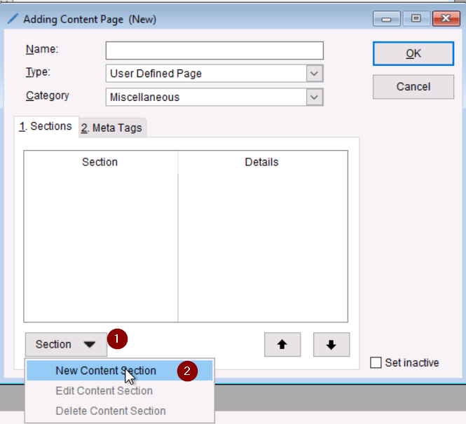
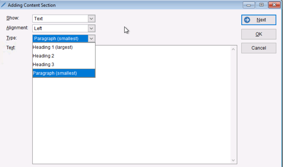
1. Text Section
Used to display written content.
You can select from several text styles:
- Heading 1 – Bold, largest font
- Heading 2 – Bold, medium font
- Heading 3 – Bold, smaller font
- Paragraph – Standard, non-bold text
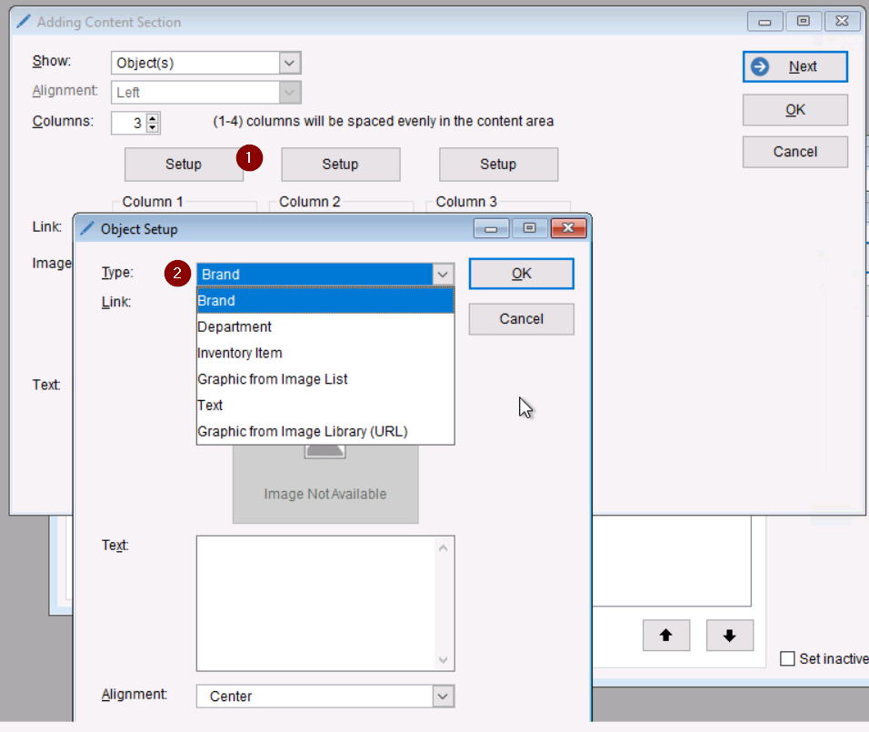
2. Object Section
An Object Section consists of 1–4 objects, forming columns within the row.
Each object can be set up using the Object Setup Form, which appears after selecting the Setup button inside the section.
When configuring an Object Section:
- Click Setup under the object you want to configure
- Two dropdowns will appear:
- Type – Select the type of content to display (Brand, Department, Graphic, etc.)
- Link – Select where the object should navigate when clicked
Each object can be customized independently, allowing for flexible layouts with mixed content types.
Object Type Options
- Brand – Displays brand image; links to that brand.
- Department – Displays department image; links to all items assigned to that department.
- Inventory Item – Displays item image; links to product detail page for that item.
- Graphic – Uses an image from your Image List or uploaded file
- Text – Displays a text object
- Graphic from URL – Displays an image pulled from a web URL
- Ensure you have authorization to use the external graphic
- Ensure you have authorization to use the external graphic
Link Options
A drop-down list determines what action occurs when a customer clicks the object.
This includes linking to brands, departments, items, or custom destinations based on the object type. *This option will be greyed out if you select brand, department, or inventory item for your type*
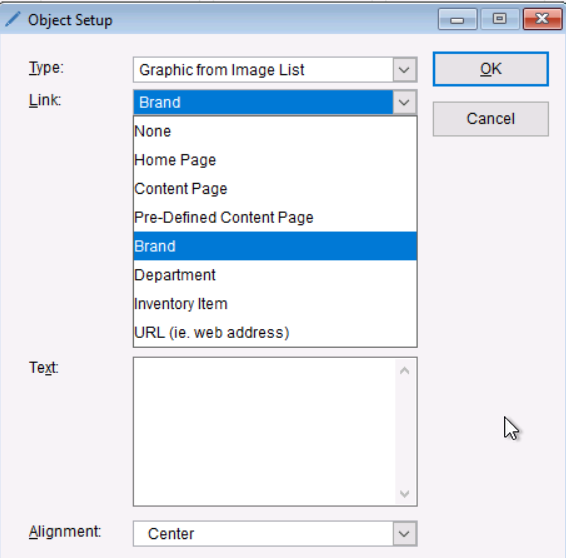
*Import note: Make sure the vendors or departments you use in your section is added in the WebStore configuration. If not added your images will come up blank or image not found*
3. Vertical Spacer
Adds extra blank space between sections to improve layout.
-
- Recommended size is Xlarge or advance < 4.0 em
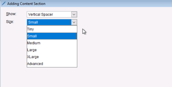
- Recommended size is Xlarge or advance < 4.0 em
Publishing and Refreshing
After editing or creating Content Pages:
- Use Preview to confirm layout and design
- Select Refresh WebStore from the Content Page List to push updates live
Please review the KB article below to apply your content pages.